
Introduction
Welcome to the ultimate guide on creating stunning and powerful charts with ChatGPT! Whether you’re a data enthusiast, a business professional, or someone who loves to visualize information, this guide will walk you through the steps to make your data shine. Let’s dive into the world of data visualization and unlock the full potential of ChatGPT!

What is CHATGPT 4o?
ChatGPT 4o is the latest iteration of OpenAI’s language model, designed to understand and generate human-like text based on the input it receives.
It is part of the GPT (Generative Pre-trained Transformer) series, known for its advanced capabilities in natural language processing (NLP).
ChatGPT 4o builds on the strengths of its predecessors with improved performance, higher accuracy, and more nuanced understanding of context.
Overall, ChatGPT 4o stands as a testament to the rapid advancements in AI and machine learning. It not only builds on the successes of its predecessors but also sets new benchmarks in performance, accuracy, and contextual understanding.
Key Features of ChatGPT 4o
Enhanced Understanding
ChatGPT 4o excels at understanding complex and nuanced prompts, offering a better grasp of context. It generates more accurate and coherent responses, making interactions feel natural. With an expanded knowledge base, it can handle a wide range of topics effectively. Its enhanced contextual awareness ensures continuity in longer conversations.
Broader Knowledge Base
ChatGPT 4o, trained on a vast amount of data, can offer information on a wide range of topics. This extensive training ensures comprehensive and up-to-date knowledge. Users can rely on it for diverse inquiries. Its broad expertise enhances its utility across various fields.
Improved Responses
ChatGPT 4o produces more accurate and coherent responses, enhancing the flow of conversations. This improvement makes interactions feel more natural and engaging. The model’s refined understanding leads to more meaningful exchanges. Users benefit from clearer and more relevant answers.

Contextual Awareness
ChatGPT 4o maintains context over longer conversations, remembering key details. It adjusts its responses based on prior exchanges. This capability ensures coherent and relevant interactions. Users experience a more seamless and personalized dialogue.
Multi-modal Capabilities
ChatGPT 4o can process inputs and generate outputs in various formats, including text and images. This enhances its versatility and utility. Users can leverage it for diverse applications. Its multi-modal capabilities make it a powerful tool.
How to use ChatGPT to make charts and tables
1. Create a Database
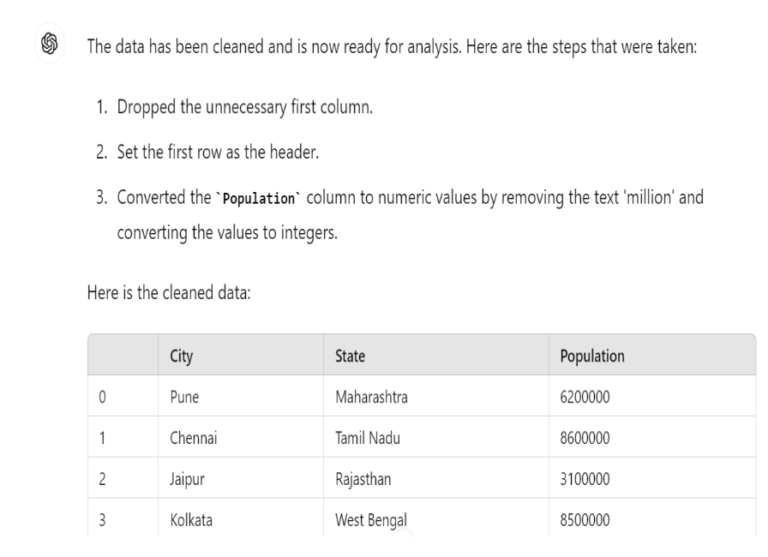
For the following demonstration, we’ll be working with the top five cities in India in terms of population.
2. Upload data
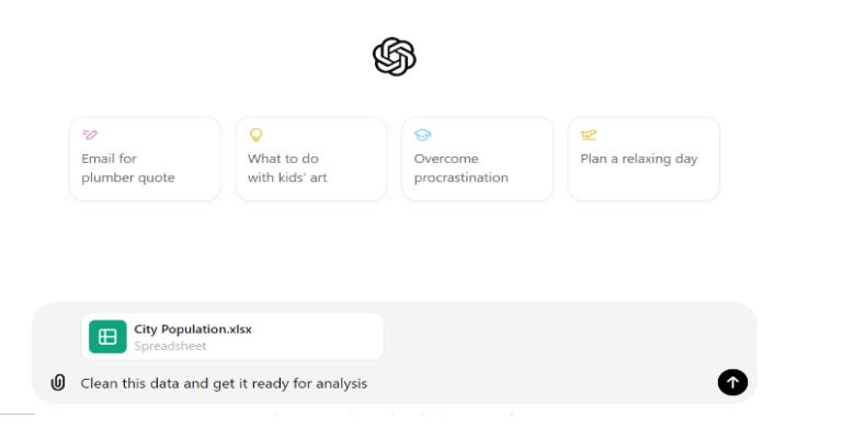
One of the remarkable capabilities of Advanced Data Analytics is its ability to upload datasets. In our case, we’ll utilize the top five cities in India in terms of population.
After downloading the dataset from the spreadsheet, simply click on the upload button within ChatGPT and specify the desired data file.
3. How to Create a Column chart
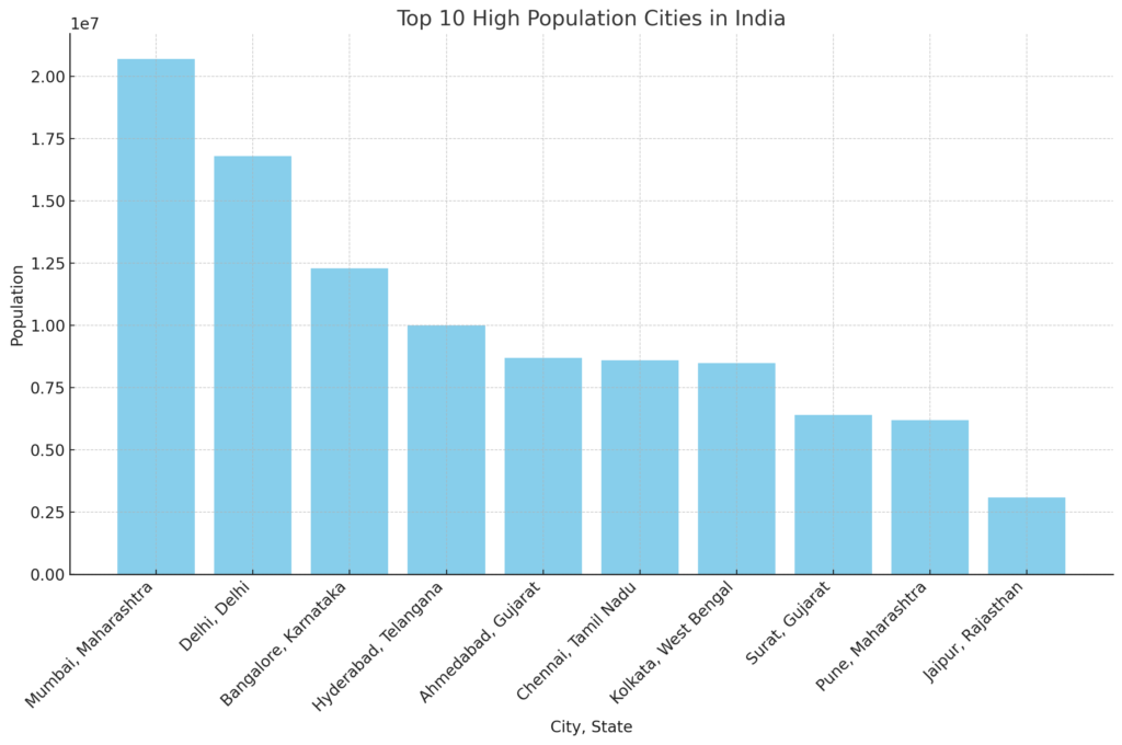
In this example, we are going to see how to create a column chart.

And here’s the result:
4. How to Create a Bar Chart
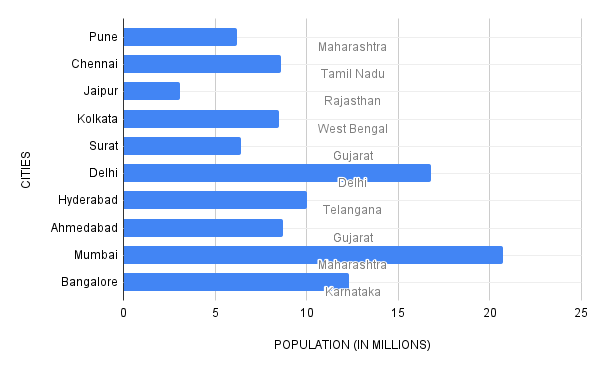
Next, We are going to see how to create Bar chart in this Example

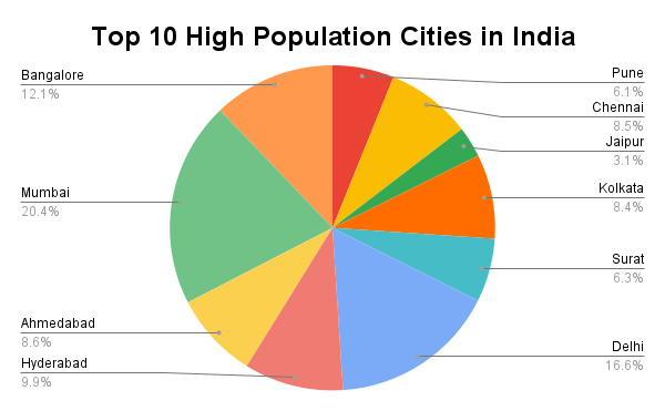
5. How to Create a Pie Chart
In this example, we’re just going to make a Simple Pie Chart

6. How to Create Pie Chart by using Changing colors
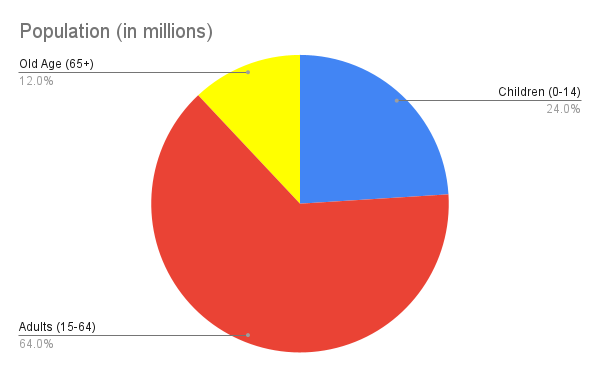
First we can create a pie chart

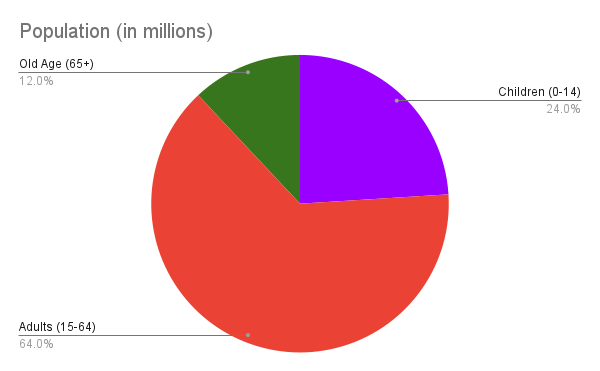
Next we can change the color of the pie chart with the help of chatgpt, We can instruct Advanced Data Analytics to use different colors.

Advanced Visualization Techniques
Take your charts to the next level with advanced techniques such as:
Sankey Diagrams: Ideal for visualizing flows and relationships within complex systems or processes, such as customer journeys or supply chain logistics.
Network Graphs: Great for showcasing relationships between interconnected entities, like social networks, organizational structures, or influencer networks.
Chord Diagrams: Perfect for illustrating relationships and connections between different entities in a circular layout, commonly used for depicting connections between categories or groups.
Word Clouds: Effective for visually representing the frequency of words or terms in a dataset, such as customer feedback, survey responses, or social media mentions.
Tree Maps: Useful for visualizing hierarchical data structures, like market segmentation, organizational hierarchies, or disk usage breakdowns.
Stream Graphs: Excellent for displaying changes over time in the composition of different categories, often used in finance, marketing, or web analytics.
- Heat Maps : Easily uncover patterns and trends within your data with our intuitive heatmap visualizations. Colorful and dynamic, our heatmaps offer quick insights into data density and distribution, empowering smarter decisions for your business or research needs. Explore with ease and clarity.
Conclusion
Creating stunning and powerful charts with ChatGPT is a game-changer for anyone who deals with data. By following this ultimate visual guide, you’ll be able to transform your raw data into compelling visual stories. So, start exploring, and let ChatGPT help you visualize your data like never before!